top of page


Baca Yogurt
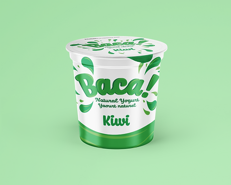
Baca Yogurt: Layout, Illustration, Typography, & Packaging
Baca is a Canadian yogurt brand built on locally sourced ingredients from Canadian farmers. The name comes from the Latin word for fruit, which anchors the brand's vibrant, color-coded packaging system where each flavor takes on the hues of its main ingredient. The identity is deliberately bold and energetic, designed to stand out in a category dominated by safe, minimal packaging. Baca positions itself against established players like Yoplait and IOGO by leading with personality, local sourcing, and eye-catching shelf presence.


bottom of page