top of page


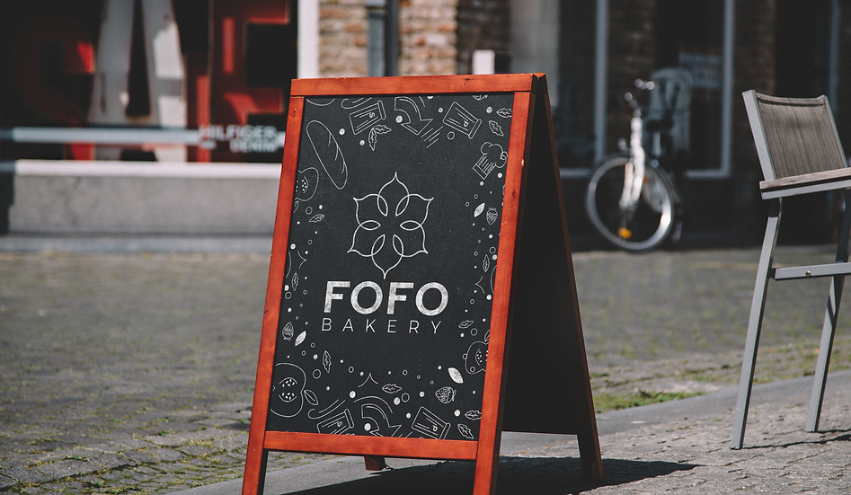
Fofo Bakery
Layout, Illustration, Typography, & Branding
FOFO is a premium Portuguese bakery brand built on authenticity and warmth. The name, meaning "fluffy" in Portuguese, reflects both the texture of the pastries and the welcoming experience the brand aims to deliver. The visual identity draws from the traditional tilework found in Portuguese homes, giving the logo a cultural anchor that feels familiar and distinct. A soft blue and pink palette speaks to the brand's primary audience of women aged 30 to 60, while the full system spans signage, packaging, cups, menus, and apparel, creating a cohesive brand experience from the storefront to the table.


bottom of page